Find the Elements
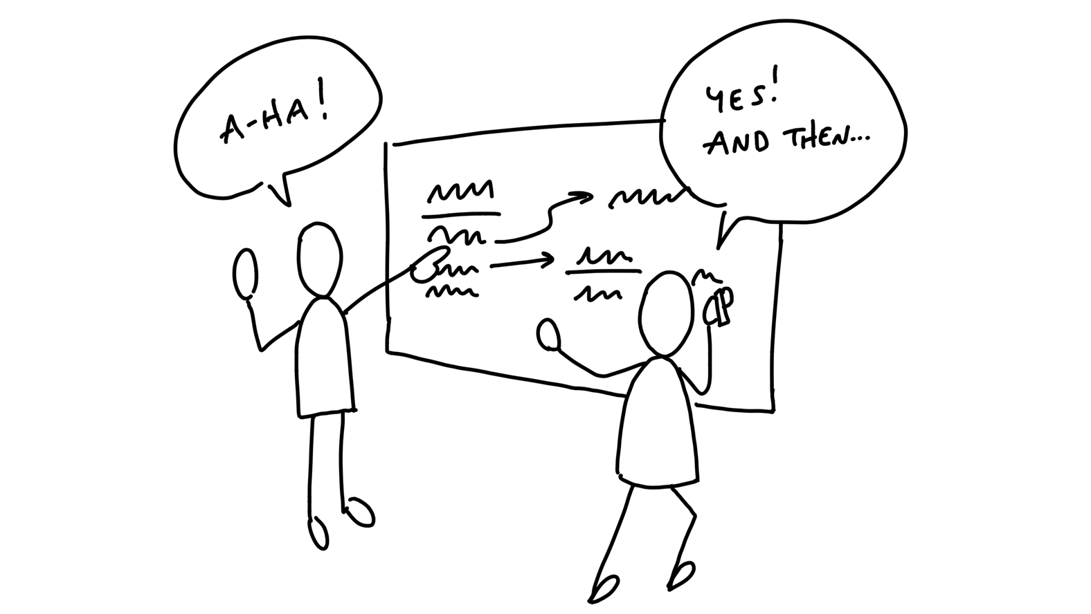
Now that we have the constraints of an appetite and the problem we’re solving, it’s time to get from an idea in words to the elements of a software solution. There could be dozens of different ways to approach the solution for a problem. So it’s important that we can move fast and cover a lot of different ideas without getting dragged down.
Move at the right speed
Two things enable us to move at the right speed at this stage.
First, we need to have the right people—or nobody—in the room. Either we’re working alone or with a trusted partner who can keep pace with us.
Someone we can speak with in shorthand, who has the same background knowledge, and who we can be frank with as we jump between ideas.
Second, we need to avoid the wrong level of detail in the drawings and sketches. If we start with wireframes or specific visual layouts, we’ll get stuck on unnecessary details and we won’t be able to explore as broadly as we need to.
The challenge here is to be concrete enough to make progress on a specific solution without getting dragged down into fine details. The questions we’re trying to answer are:
- Where in the current system does the new thing fit?
- How do you get to it?
- What are the key components or interactions?
- Where does it take you?
To stay on the right level of detail and capture our thoughts as they come, we work by hand using a couple of prototyping techniques: breadboarding and fat marker sketches.
These allow us to quickly draw different versions of entire flows so we can debate the pros and cons of each approach and stay aligned with what we’re talking about as we go.
Breadboarding
We borrow a concept from electrical engineering to help us design at the right level of abstraction. A breadboard is an electrical engineering prototype that has all the components and wiring of a real device but no industrial design.

Deciding to include an indicator light and a rotary knob is very different from debating the chassis material, whether the knob should go to the left of the light or the right, how sharp the corners should be, and so on.
Similarly, we can sketch and discuss the key components and connections of an interface idea without specifying a particular visual design. To do that, we can use a simple shorthand. There are three basic things we’ll draw:
- Places: These are things you can navigate to, like screens, dialogs, or menus that pop up.
- Affordances: These are things the user can act on, like buttons and fields. We consider interface copy to be an affordance, too. Reading it is an act that gives the user information for subsequent actions.
Connection lines: These show how the affordances take the user from place to place.
We’ll use words for everything instead of pictures. The important things are the components we’re identifying and their connections. They allow us to play out an idea and judge if the sequence of actions serves the use case we’re trying to solve.
Example
Suppose our product is an invoicing tool. We’re considering adding a new “Autopay” feature to enable our customers’ customers to pay future invoices automatically.
How do you turn Autopay on? What’s involved? We can pick a starting point and say that the customer landed on an invoice. That’s our first place.
We draw it by writing the name of the place and underlining it.

On the invoice, we’re thinking we could add a new button to “Turn on Autopay.” That’s an affordance. Affordances go below the line to indicate they can be found at that place.

Where does that button go? Some place for setting up the Autopay. We don’t have to specify whether it’s a separate screen or a pop up modal or what. From a what’s-connected-to-what standpoint (the topology) it’s all the same.
Let’s draw a connection line from the button to the Setup Autopay screen.

Now we can talk about what belongs on that screen. Do we ask for a credit card here? Is there a card on file already? What about ACH or other payment methods?
Just figuring out what to write under the bar starts to provoke debates and discussions about what to build.
As we think it through, we decide we should ask for credit card details here and show the logo of the financial institution (an aspect of the domain in this specific product).

Straightforward enough. But wait — did we actually pay the original invoice or not? Hm. Now we have both functional and interface questions. What does enabling Autopay actually do? Does it apply only for the future or does paying with Autopay the first time also pay the current invoice? And where do we explain this behavior? We’re starting to have deeper questions and discussions prompted by just a few words and arrows in the breadboard.
Since we’re using such a lightweight notation, and we aren’t bogged down with wireframes, we can quickly jump around and entertain different possibilities.
We could add an option to the Setup screen…

But now we’re complicating the responsibilities of the confirmation screen. We’re going to need to show a receipt if you pay your balance now. Should the confirmation have a condition to sometimes show a receipt of the amount just paid?
How about an entirely different approach. Instead of starting on an Invoice, we make Autopay an option when making a payment. This way there’s no ambiguity about whether the current amount is being paid. We could add an extra “Autopay was enabled” callout to the existing payment confirmation page.
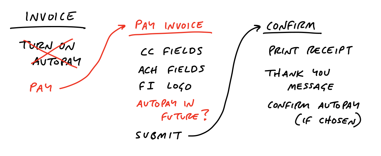
Sketching this out reminded us that the current payment form supports ACH in addition to credit card. We discuss and confirm that we can use ACH too.
What about after Autopay is enabled? How does the customer turn it off? Up to this point, many customers in the system didn’t have usernames or passwords. They followed tokenized links to pay the invoices one by one. One might naturally assume that now that the customer has something like Autopay, they need a username and password and some landing place to go manage it.
The team in this case decided that adding the username/password flows was too much scope for their appetite at the time.
Reflecting strategically on what they knew about their customers, they thought it would be quite alright if the invoicer’s customers had to reach out to the invoicer and ask them to turn off the Autopay. In that case we could add a single option to disable Autopay in the customer detail page that we already offered to invoicers. We drew out the flow like this:

This example illustrates the level of thinking and the speed of movement to aim for during the breadboarding phase.
Writing out the flows confronts us with questions we didn’t originally think of and stimulates design ideas without distracting us with unimportant visual choices.
Once we get to a place where we play through the use case and the flow seems like a fit, we’ve got the elements we need to move on to start defining the project more clearly. We’re getting more concrete while still leaving out a huge amount of detail.
Fat marker sketches
Sometimes the idea we have in mind is a visual one. Breadboarding would just miss the point because the 2D arrangement of elements is the fundamental problem. In that case, we still don’t want to waste time on wireframes or unnecessary fidelity. Instead we use fat marker sketches.
A fat marker sketch is a sketch made with such broad strokes that adding detail is difficult or impossible. We originally did this with larger tipped Sharpie markers on paper. Today we also do it on iPads with the pen size set to a large diameter.
Here’s an example.
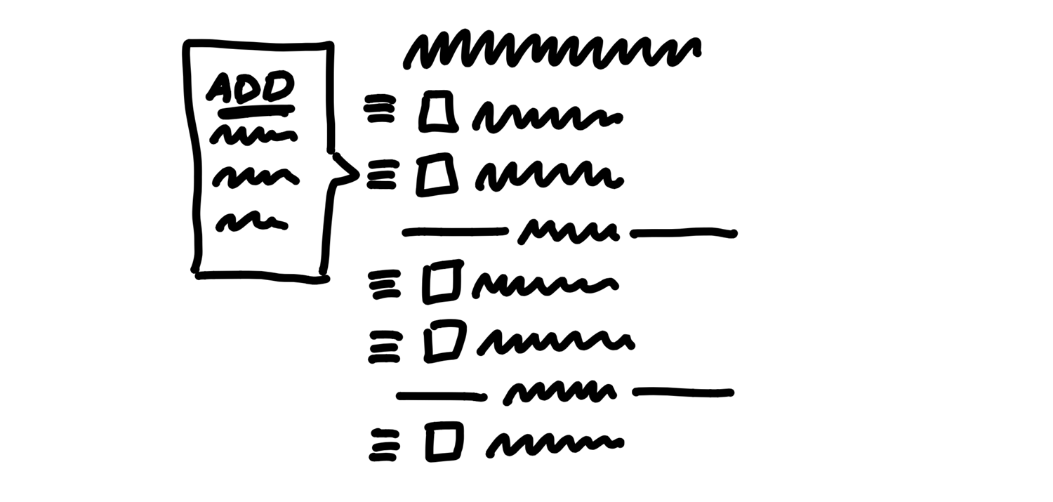
We found ourselves often creating fake to-dos in our Basecamp to-do lists that acted as dividers. We’d create an item like “––– Needs testing –––“ and put items below it. We had the idea to make some kind of official divider feature in our to-do tool to turn the workaround into a first class function of to-do lists.
We had to work out what the implications of adding a divider were. We came up with a rough idea that adding a divider separates the list into “loose” to-dos above the divider and “grouped” to-dos below. Adding subsequent dividers adds more groups below the “loose” items at the top.
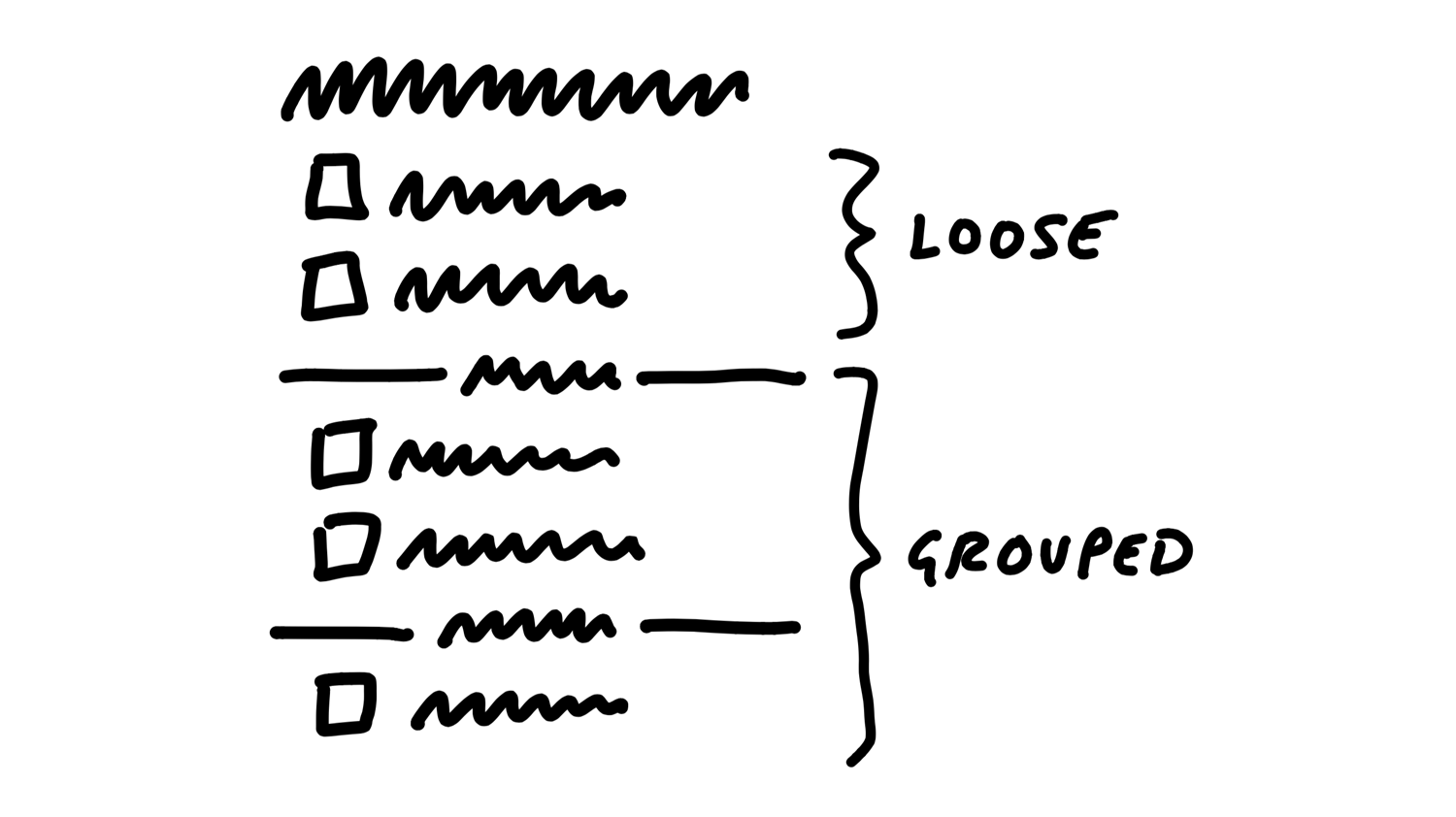
We could add items via some affordance within each group, including the “loose” group on top.
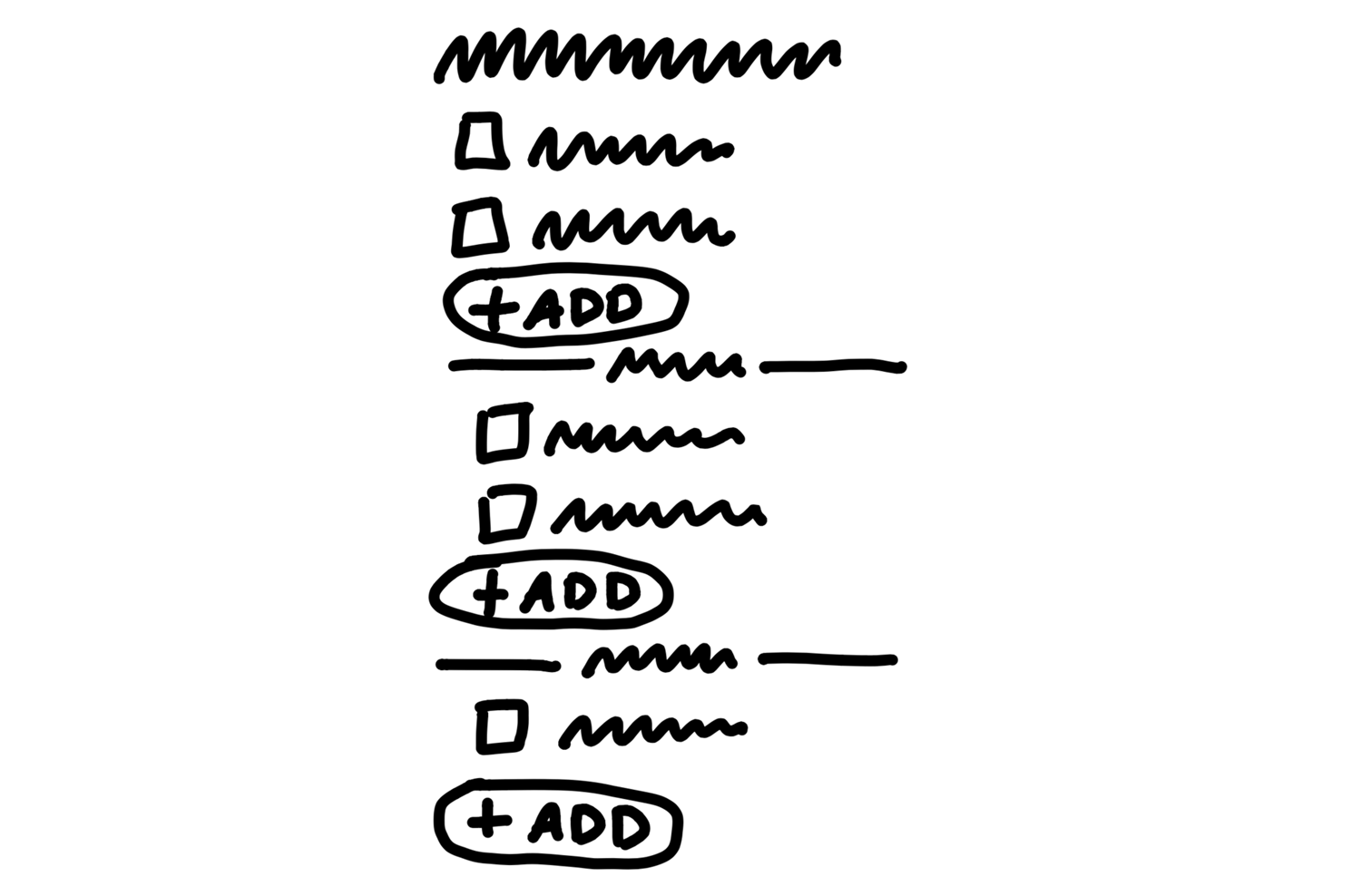
We were a little concerned the add buttons might break up the gestalt of the list, and the groups might all separate too much from the lists on the page. We talked about possibilities to place the “add” affordance inside of a menu that we already had to the left of each to-do item.
This notation is much less constraining than breadboards, which has downsides. We might sketch a sidebar and get attached to a layout element like that even though it’s not a core element. But as long as we keep an eye on that we’re still far better off than if we get sucked into the weeds by creating wireframes too early.
It may seem a little silly to call fat marker sketches a technique or a tool. The reason for calling them out is we too easily skip ahead to the wrong level of fidelity.
Giving this rough early stage a name and using a specific tool for it helps us to segment our own creative process and make sure we aren’t jumping ahead to detail a specific idea when we haven’t surveyed the field enough.
Elements are the output
In the case of the Autopay example, we ended up with some clear elements:
- A new “use this to Autopay?” checkbox on the existing “Pay an invoice” screen
- A “disable Autopay” option on the invoicer’s side
For the To-Do Groups project, the elements were:
- Loose to-dos above the first group belong directly to the parent
- Grouped to-dos appear below the loose to-dos
- We’d like to try an add affordance within each section, but if that doesn’t work visually, we’re ok with relying on the action menu for inserting to-dos into position.
Similarly, when we sketched the simplified solution for rendering events on a calendar grid, we used the fat marker approach.
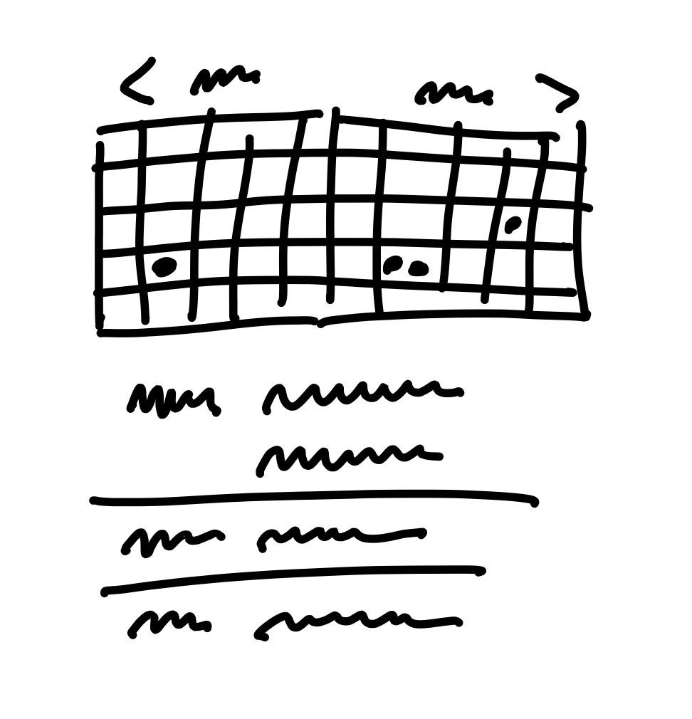
This enabled us to work out the main elements of the solution:
- A 2-up monthly calendar grid
- Dots for events, no spanned pills
- Agenda-style list of events below that scrolls an event into view when you tap a dot
This list of elements is extremely narrow and specific compared to “monthly calendar.” Exactly the kind of narrowing we hope to accomplish through the shaping process.
Room for designers
Later, when it’s time to involve a designer, you don’t want to have to say “I know I drew it like this but ignore that…”.
Regardless of what you say, any specific mockups are going to bias what other people do after you—especially if you’re in a higher position than them. They’ll take every detail in the initial mockups as direction even though you didn’t intend it.
Working at the right “level of abstraction” not only ensures we move at the right speed, it also leaves this important room for creativity in the later stages.
By leaving details out, the breadboard and fat marker methods give room to designers in subsequent phases of the project.
This is a theme of the shaping process. We’re making the project more specific and concrete, but still leaving lots of space for decisions and choices to be made later. This isn’t a spec. It’s more like the boundaries and rules of a game. It could go in countless different ways once it’s time to play.
Not deliverable yet
This step of shaping is still very much in your private sphere.
It’s normal for the artifacts at this point — on the wall or in your notebook — to be more or less indecipherable to anybody who wasn’t there with you.
We’ve gone from a cloudy idea, like “autopay” or “to-do groups,” to a specific approach and a handful of concrete elements. But the form we have is still very rough and mostly in outline.
What we’ve done is landed on an approach for how to solve the problem. But there may be some significant unknowns or things we need to address before we’d consider this safe to hand off to a team to build successfully.
The next step is to do some stress-testing and de-risking. We want to check for holes and challenges that could hinder the project from shipping within the fixed time appetite that we have in mind for it.
After that we’ll see how to wrap up the shaped concept into a write-up for pitching.
No conveyor belt
Also keep in mind that, at this stage, we could walk away from the project. We haven’t bet on it.
We haven’t made any commitments or promises about it. What we’ve done is added value to the raw idea by making it more actionable. We’ve gotten closer to a good option that we can later lobby for when it’s time to allocate resources.